100个自媒体平台推荐(必须收藏)
236
2022-11-10
CSS实现一个旋转的加载页面静态效果图:
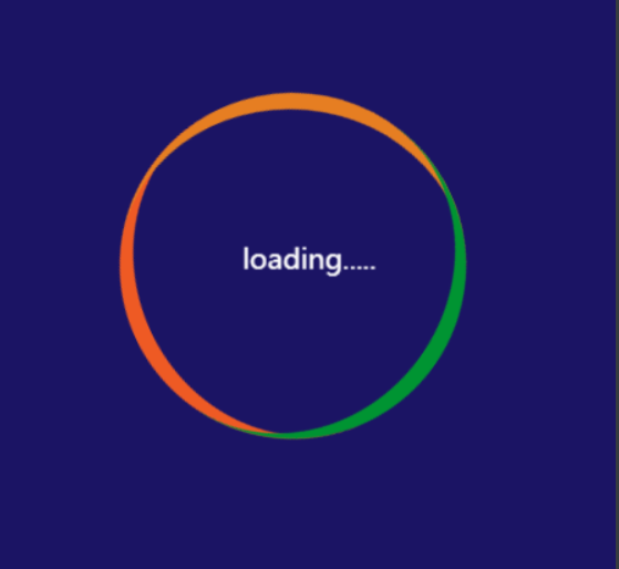
html代码:
  <div class="loading">
     <span>loading.....span>
  div>
</body>
CSS代码:
    * {
        /* 初始化 取消页面内外边距 */
        margin: 0;
        padding: 0;
    }
    body {
        /* 100%窗口高度 */
        height: 100vh;
        /* 渐变背景 */
        background: linear-gradient(to bottom, #2b5876, #09203f);
        /* 弹性布局 水平、垂直居中 */
        display: flex;
        justify-content: center;
        align-items: center;
        color: white;
    }

    .loading{
      width: 200px;
      height: 200px;
      box-sizing: border-box;
      /* background-color: #911f7e; */
      border-radius: 50%;
      border-top: 10px solid #EE5A24;
      position: relative;
      animation: a1 2s linear infinite;
    }
    .loading::before,.loading::after{ /*伪元素一定要与content一起使用。::brfore表示在loading前面加东西,::after表示在元素后面加内容。content就是内容*/
      content: '';
      width: 200px;
      height: 200px;
      /* background: red; */
      position: absolute;
      left: 0;
      top: -10px;
      box-sizing: border-box;
      border-radius: 50%;
    }
    .loading::before{
      border-top: 10px solid #e67e22;
      transform: rotate(120deg);
    }
    .loading::after{
      border-top: 10px solid #009432;
      transform: rotate(240deg);
    }
    .loading span{
      position: absolute;
      width: 200px;
      height: 200px;
      text-align: center;
      line-height: 200px;
      animation: a2 2s linear infinite;
    }
    @keyframes a1{
      to{transform: rotate(360deg);}
    }
    @keyframes a2{
      to{transform: rotate(-360deg);}
}#免责声明#
爱尔美收录网提供的一切软件、教程和内容信息仅限用于学习和研究目的;不得将上述内容用于商业或者非法用途,否则,一切后果请用户自负。本站信息来自网络收集整理,版权争议与本站无关。您必须在下载后的24个小时之内,从您的电脑或手机中彻底删除上述内容。如果您喜欢该程序和内容,请支持正版,购买注册,得到更好的正版服务。我们非常重视版权问题,如有侵权请邮件vip@iermei.com与我们联系处理。敬请谅解!
本文地址:https://www.iermei.com/xq/2056.html